KidStrong Coach App
A complete redesign that puts coaches' needs first.
Timeline
2022 - present
Role
Sole UX/UI Designer
Team
6 developers, 1 PM
Tools
Figma, Flutter, ClickUp


Problem
KidStrong's original coaching platform, built in a game engine, was fundamentally limiting the effectiveness of coaches across 100+ centers. The app's technical constraints led to frequent crashes, slow performance, and scattered information architecture, while its unintuitive design created unnecessary complexity in routine tasks. As a result, coaches were spending nearly half their time managing technical issues and hunting for information instead of focusing on what matters most - delivering an exceptional experience to kids and families.
Featured Solutions
(01)
solutions
Dive into the key features and design decisions that solved critical user problems.

Photo Management Reimagined
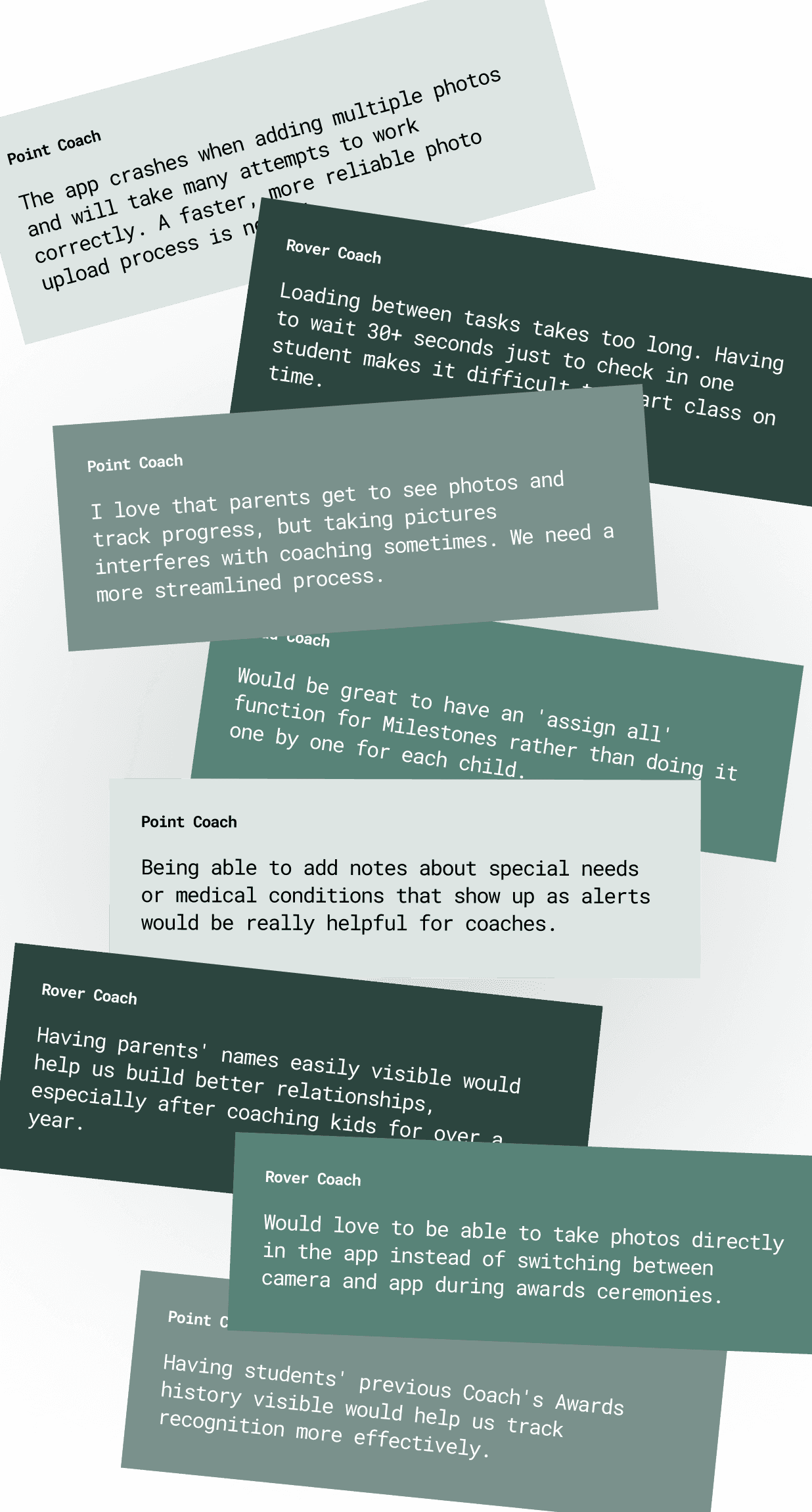
"Taking, uploading, and tagging photos is tedious and often crashes" - Feedback from 65% of survey participants about the original app.
Transformed a cumbersome file upload process into an integrated system with in-app photography, multi-select capabilities, and accessible viewing options, reducing photo management time by 80% while improving photo quality and coach satisfaction.

Navigation Redesign
A restrictive, portrait-locked interface with ambiguous icons forced coaches to adapt their teaching style to the original app's limitations rather than the app supporting their natural workflow
Designed an intuitive, orientation-adaptive navigation system with clear labeling and familiar patterns, transforming a major usability barrier into a seamless experience that supports natural workflows.

Information Architecture Optimized
The original app scattered critical student details across multiple screens with unclear labeling and navigation, forcing coaches to constantly context-switch and hunt for information during time-sensitive classes.
Created a centralized, customizable interface that intelligently groups student information and actions, transforming a fragmented experience into a streamlined workflow that puts coaches in control of how they view and access information.
Process
(02)
Process highlights
A peek behind the curtain at crucial insights and challenges that shaped the work.
Key Discovery
Through our user reseach, we discovered that quick access to relevant information mattered more to users than how the information itself was presented.
Main Challenge
Balancing feature-rich functionality with simple, intuitive interfaces that work in fast-paced class environments.
Critical iteration
Rebuilt photo management system three times based on pilot feedback to find the perfect balance of speed and usability.

Outcomes
(03)
results
Real-world impact and measurable outcomes that demonstrate success.
80%
improvement in coach satisfaction scores
40%
reduction in class management time
20%
reduction in user wait times for screen loading
Sabre has done some very impressive work designing the Coach App. Not only does it look great, but she has put a lot of thought and effort into ensuring every detail is functional and cohesive. Everything from errors, loading states, and corner cases has been thought of and designed for with the user in mind.
Josh Komie
(
Software Engineer
)
KidStrong Coach App
A complete redesign that puts coaches' needs first.
Timeline
2022 - present
Role
Sole UX/UI Designer
Team
6 developers, 1 PM
Tools
Figma, Flutter, ClickUp


Problem
KidStrong's original coaching platform, built in a game engine, was fundamentally limiting the effectiveness of coaches across 100+ centers. The app's technical constraints led to frequent crashes, slow performance, and scattered information architecture, while its unintuitive design created unnecessary complexity in routine tasks. As a result, coaches were spending nearly half their time managing technical issues and hunting for information instead of focusing on what matters most - delivering an exceptional experience to kids and families.
Featured Solutions
(01)
solutions
Dive into the key features and design decisions that solved critical user problems.

Photo Management Reimagined
"Taking, uploading, and tagging photos is tedious and often crashes" - Feedback from 65% of survey participants about the original app.
Transformed a cumbersome file upload process into an integrated system with in-app photography, multi-select capabilities, and accessible viewing options, reducing photo management time by 80% while improving photo quality and coach satisfaction.

Navigation Redesign
A restrictive, portrait-locked interface with ambiguous icons forced coaches to adapt their teaching style to the original app's limitations rather than the app supporting their natural workflow
Designed an intuitive, orientation-adaptive navigation system with clear labeling and familiar patterns, transforming a major usability barrier into a seamless experience that supports natural workflows.

Information Architecture Optimized
The original app scattered critical student details across multiple screens with unclear labeling and navigation, forcing coaches to constantly context-switch and hunt for information during time-sensitive classes.
Created a centralized, customizable interface that intelligently groups student information and actions, transforming a fragmented experience into a streamlined workflow that puts coaches in control of how they view and access information.
Process
(02)
Process highlights
A peek behind the curtain at crucial insights and challenges that shaped the work.
Key Discovery
Through our user reseach, we discovered that quick access to relevant information mattered more to users than how the information itself was presented.
Main Challenge
Balancing feature-rich functionality with simple, intuitive interfaces that work in fast-paced class environments.
Critical iteration
Rebuilt photo management system three times based on pilot feedback to find the perfect balance of speed and usability.

Outcomes
(03)
results
Real-world impact and measurable outcomes that demonstrate success.
80%
improvement in coach satisfaction scores
40%
reduction in class management time
20%
reduction in user wait times for screen loading
Sabre has done some very impressive work designing the Coach App. Not only does it look great, but she has put a lot of thought and effort into ensuring every detail is functional and cohesive. Everything from errors, loading states, and corner cases has been thought of and designed for with the user in mind.
Josh Komie
(
Software Engineer
)
KidStrong Coach App
A complete redesign that puts coaches' needs first.
Timeline
2022 - present
Role
Sole UX/UI Designer
Team
6 developers, 1 PM
Tools
Figma, Flutter, ClickUp


Problem
KidStrong's original coaching platform, built in a game engine, was fundamentally limiting the effectiveness of coaches across 100+ centers. The app's technical constraints led to frequent crashes, slow performance, and scattered information architecture, while its unintuitive design created unnecessary complexity in routine tasks. As a result, coaches were spending nearly half their time managing technical issues and hunting for information instead of focusing on what matters most - delivering an exceptional experience to kids and families.
Featured Solutions
(01)
solutions
Dive into the key features and design decisions that solved critical user problems.

Photo Management Reimagined
"Taking, uploading, and tagging photos is tedious and often crashes" - Feedback from 65% of survey participants about the original app.
Transformed a cumbersome file upload process into an integrated system with in-app photography, multi-select capabilities, and accessible viewing options, reducing photo management time by 80% while improving photo quality and coach satisfaction.

Navigation Redesign
A restrictive, portrait-locked interface with ambiguous icons forced coaches to adapt their teaching style to the original app's limitations rather than the app supporting their natural workflow
Designed an intuitive, orientation-adaptive navigation system with clear labeling and familiar patterns, transforming a major usability barrier into a seamless experience that supports natural workflows.

Information Architecture Optimized
The original app scattered critical student details across multiple screens with unclear labeling and navigation, forcing coaches to constantly context-switch and hunt for information during time-sensitive classes.
Created a centralized, customizable interface that intelligently groups student information and actions, transforming a fragmented experience into a streamlined workflow that puts coaches in control of how they view and access information.
Process
(02)
Process highlights
A peek behind the curtain at crucial insights and challenges that shaped the work.
Key Discovery
Through our user reseach, we discovered that quick access to relevant information mattered more to users than how the information itself was presented.
Main Challenge
Balancing feature-rich functionality with simple, intuitive interfaces that work in fast-paced class environments.
Critical iteration
Rebuilt photo management system three times based on pilot feedback to find the perfect balance of speed and usability.

Outcomes
(03)
results
Real-world impact and measurable outcomes that demonstrate success.
80%
improvement in coach satisfaction scores
40%
reduction in class management time
20%
reduction in user wait times for screen loading
Sabre has done some very impressive work designing the Coach App. Not only does it look great, but she has put a lot of thought and effort into ensuring every detail is functional and cohesive. Everything from errors, loading states, and corner cases has been thought of and designed for with the user in mind.
Josh Komie
(
Software Engineer
)


